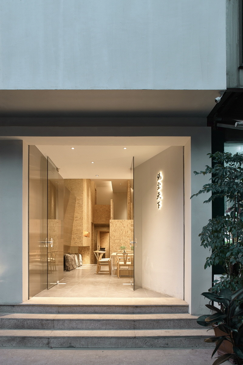
Design is never the intentional decoration with rouge and powder, nor the selfproclaim running after the trend; it is the power, going through the appearance, directly hitting your heart, and weakening your dream for the real. It is with this humility that the teahouse Jue Chen Tian Xia shows the original look of design to the world. Limited by the narrow and cramped space on site, the designer Huang Feng makes design with the aesthetic philosophy of “big in small” and the narrative design language. The appearance of the transparent building glass and the interior modeling with interspersed blocks create a look of the nature and inspires the curiosity and adventure spirit of the audience. Strength and wisdom can be felt here and there from the relaxation and tightness of design, just like a terse but forceful andate, or the warm and pure rock tea, spreading the primitive, quiet, and elegant aesthetic perception.
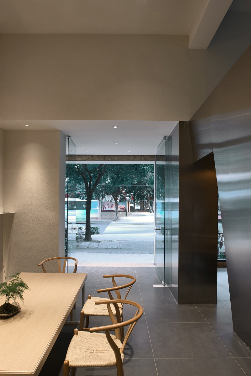
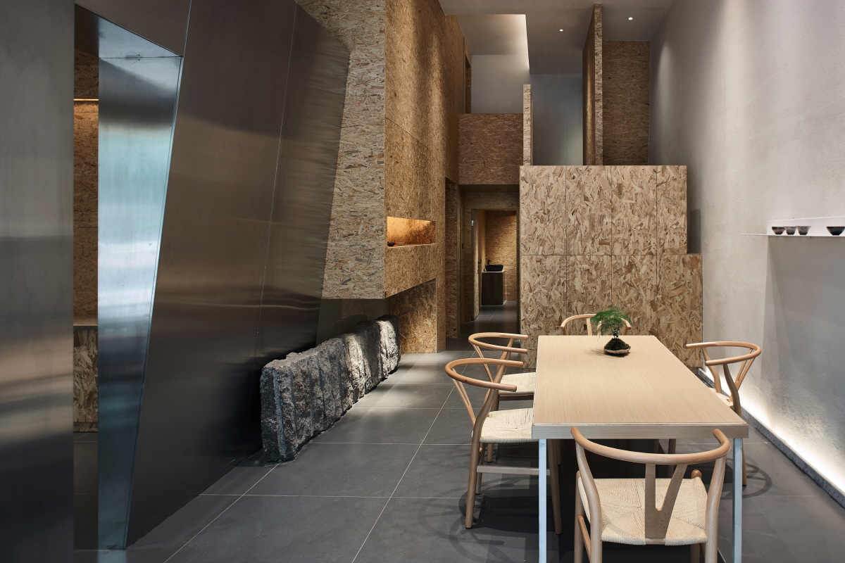
T he teahouse is made by transforming the two stores, each with length of 15m, width of 3.4m, and height of 4.2m. The glass entrance door and the glass façade of the teahouse constitute a uniform appearance, revealing the openness of the internal space. The import of the community concept enriches the interaction between the internal and the external space of the teahouse and creates an amiable sense of belonging. The gray transitional space created by the bevel wall at the entrance side reinforces the ceremonial sense and builds an obstructive visual effects, just like a maid playing the lute with half of her face concealed, which further inspires the imagination of the audience. The overall design highlights the principle of “open after hidden”. The interior public area looks spacious and changeable, making the visitors feel sudden spacious after stepping on the relatively narrow entrance door. The actually very limited space is enlarged unexpectedly thanks to the repeated deliberation and consideration. As for function area divisions, the ground floor is divided into two parlors and three VIP rooms facing the street. Furthermore, if make further exploration on the ground floor, you will find a big surprise that the ascending stairs are hidden in the middle of the OSB boards acted both the cabinet and the partition wall. On the second floor, two VIP rooms, the office area, and the storage area are designed. Different designed height of these rooms safeguards the comfort level of each function area and reflect the internal rhythm of the space.
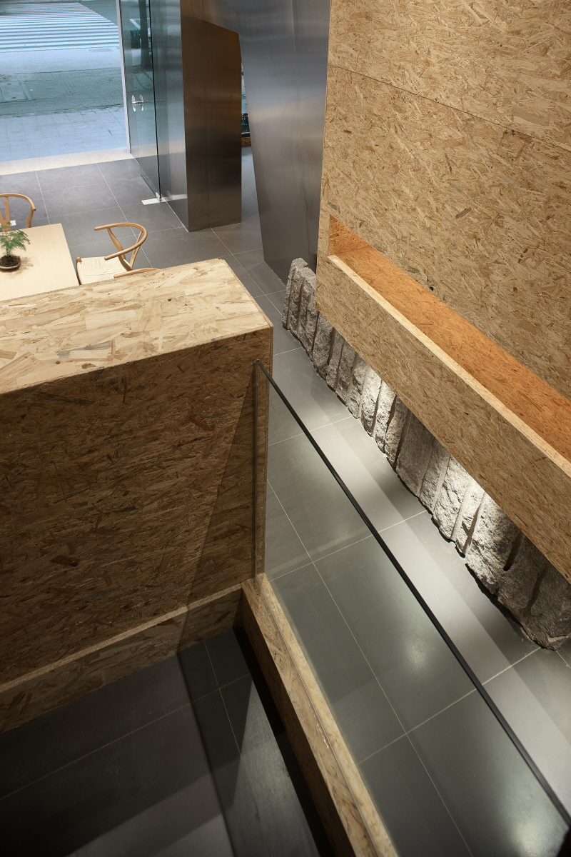
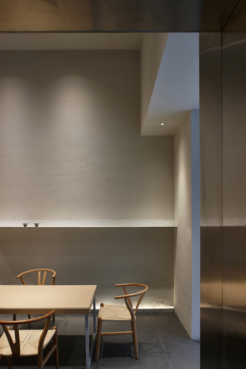
The external rhythm changes, naturally, witty, and full of humor. The wall made of stainless steel boards and OSB boards breaks the traditional stiff partition of different areas; the high-low alternative structure builds the calm and quiet sense of sculptures and architectural blocks and, while relieving the sense of space pressure and extending the eyesight, creates a well-stratified and dynamic image. The change between light and the shade and the comparison between stiffness and flexibility, of the materials realize the transition and conversion of different areas. When there are guests sitting and tasting the tea quietly, such change and comparison disappear and give back the harmonious and appropriate scenery. It is in this teahouse that the designer builds a realm for the soul, easy, simple, but full of the beauty of force, with his perception and comprehension about the humanistic spirit. Walking in this space, enjoying the tea over the table with your friends, you will have not only the visual feast, the fragrant tea, the beautiful design, but also a cozy living and traveling space, and a realm of soul with which you will have reactions.


0개의 댓글
댓글 정렬